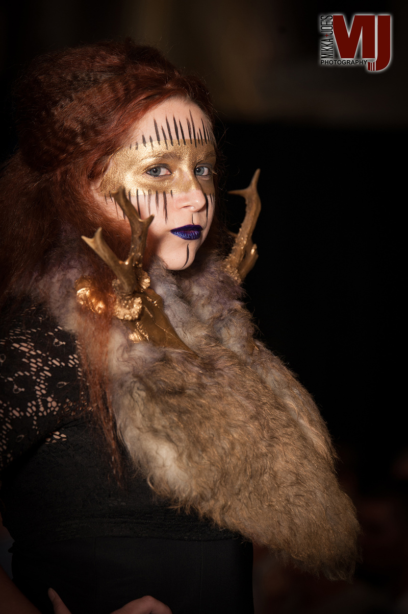
October 29, 2015 12:56am Hands down best in your port. Although, the picture would look better with a little post work, her eyes are blood shot and the contrast/exposure could do with some adjusting. She seems a little too far towards the left (the bottom right shows too much spacing, if both sides are equal, would make the picture "sit" better". Also, I found your logo to be too big and very distracting, takes the focus off the picture. Other then that, I adore the concept, the lighting used, styling and the makeup, very well thought out and original. Reminds me of the old painting of queens. Good job by all