Aaron Sekora - Thinkers

Profile > portfolio > Aaron Sekora's Photos Report this image
Email to a friend
Add to list
Toggle Worksafe Mode: Off | On

Caption: Thinkers
Likes: 0
Location: PA
Copyright: Aaron C. Sekora
Uploaded: Sep 19, 2007
Credits:
Lists:
View All Comments

Liz River

October 30, 2007 9:32am
This photo rocks my socks.


Nathie

October 24, 2007 10:18am
Brilliant series!


Lena Meow

October 24, 2007 12:38am
This is a brilliant image with perfect composition. Amazing work and the perfect title.


Michael A Wynne

October 16, 2007 6:45pm
Great idea!!! love this shot


Rayhaana

October 16, 2007 6:03pm
just amazingi love ur work


Ting Ting

October 16, 2007 3:40pm
very cool. I love the concept :)


Melika Queely

October 05, 2007 6:10pm
fantastic, love the theme, makes me laugh too!


Deactivated member

October 03, 2007 9:14pm
beautifuly structured and captured.. love it!


Gone but not forgotten

October 02, 2007 8:46am
Dis here is FABULOOOOUUUUUUS!!!!


heavenlydevil

October 01, 2007 3:57pm
very unique picture i love the pose


ack

September 30, 2007 10:28pm
love this!


Erotica Mystique

September 29, 2007 1:57am
Absolutely love this shot. It's as if you caught an unexpected moment in time. Beautifully done.


Teri O

September 27, 2007 11:28pm
I love this shot looks very relaxing


Sarah Lewis

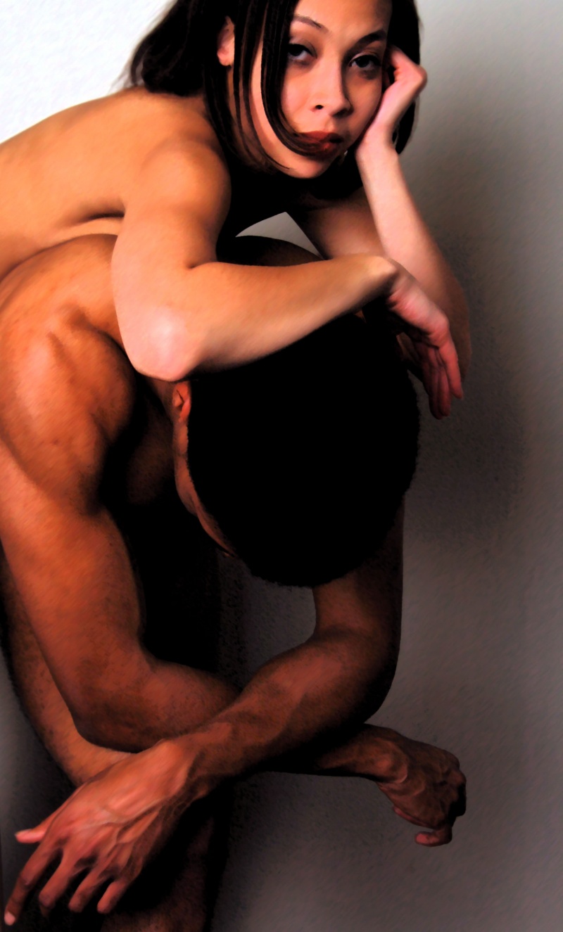
September 27, 2007 4:56pm
Have you heard of pilobolus? It's a modern dance company that focuses on equal weight share. Sometimes they perform implied nude. It's really gorgeous.
Some of your work really stands out in this way. I love it.


Please erase this profi

September 25, 2007 10:34pm
Sweet shot man


Ashly-Rae

September 24, 2007 9:06pm
this is so cool.. i love her expression.


trendplayer

September 23, 2007 5:21pm
creative pose >>> great color and look >>> fantastic shot


Aaron Sekora

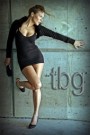
September 23, 2007 10:23am
your insight is very valid, the two things you pointed out: "soft" and non-filled shadows is done on purpose, to destroy the "fine" quality that is photography (deconstruct it a , resolution is WAY down, so when printed big on canvas, the pixels conflict with the "grain" of the canvas' surface, etc) and the big shadow dead in the middle, the visual "hole," is to invert the traditional, more centralized composition... but by doing this, it may appear as an unrealized/unprofessional portrait. Luckily, that's what I wanted.... but this is exactly the things I debated with myself before putting this image out to the (professionaal photographic) world to represent myself. Catch 22: be an artist doing something different, and in the process, do photography "wrong"... thank you very much for starting this debate, it's central to my work for sure!


ifotou

September 23, 2007 5:46am
Constructive criticisim on this is that it looks a little soft (maybe the resize) but the composition and concept are fantastic. maybe a reflector giving a little more light in the shadow to the right hand side of the picture would give it more definition and more 3d look.

I do very much like this though


LaLoba Leukos

September 23, 2007 5:02am
i love this one. you have great ideas