September 25, 2007 3:52pm This looks fantastic! The eyelashes came out great too. Always glad I can be there "just in time" for you. Hopefully next time I can be there the whole shoot. Can't wait!
September 21, 2007 3:03pm Response:
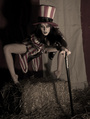
There are several posters of the original floating around... I was not as fond of the orange border, but I loved the drop shadow ones. This is actually closer to the posted the did in Europe for the film. In truth, this is an homage, not an exact copy, which is actually why I reversed the colors... white hat, black suspenders, and of course no other clothing including the iconic eyeball cufflinks. Also, ya know, it's a girl, and a red-head. But I do appreciate comments from fans of the original. -- R.
September 21, 2007 2:59pm Cheeky. Well executed, with some subtle departures from the original. Alex had more of a smirk than a smile, and he was wearing a black hat. I think you could have brought her breast forward, to come closer to the position of the eyeball in the original poster. The type in your poster is more elongated, but it generally captures the feel of the original. I think outlining the A all around (done as an orange to yellow-orange gradient in the original) works better than just having a drop shadow at the bottom. None of this is meant as a put-down. I like what you've done a lot.